I design applications for doctors. Doctors HATE clicking a mouse. If there is one overriding comment I’ve heard from doctors over the years, it is to “please reduce the number of clicks” (but they usually substitute the word “please” with more creative words).
I understand their frustrations. As usability experts, we know that the number of clicks is not the only thing that contributes to software usability. There are many other factors that influence a user’s experience with software. But for some reason, the number of clicks is what doctors seem to detest the most.
That leads me to my experience with my Cuisinart toaster oven. I’ve had this Cuisinart toaster oven for probably close to 10 years. Let me walk you through the hell of heating up an Ellio’s pizza for my daughter on this toaster oven.
You would think heating a frozen pizza in a toaster oven would be a pretty common use case. And so you’d imagine that the designers of the oven would probably have considered this scenario. So when they were designing the interface with all the buttons, the dials, the different heating options, the temperature and timer settings, etc., they would have walked through this scenario, observed users, asked them questions, tested reheating different frozen pizzas, etc.
Unfortunately I’m pretty sure none of that happened when this toaster oven was built.
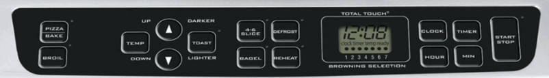
Here is a picture of the ‘beautiful’ interface.
To heat an Ellio’s pizza you first click the “Pizza/Bake” button, then you have to click the “Temp” button. Why I just can’t start clicking the up and down arrows to adjust the temperature is beyond me. But apparently the designers felt I must tell the oven that I am about to hit the up and down temperature buttons, by first clicking the “Temp” button!
So now I can start adjusting the temperature with the up and down buttons. Since the oven temp defaults to 150 degrees, and the Ellio’s pizza instructions says I must pre-heat the oven to 425, I have a lot of clicking to do. The up and down buttons increment the temperature 25 degrees for every click, so it takes eleven clicks to get it to 425 degrees. Imagine that… Eleven clicks! (I think the doctors would throw the computer at me if I designed a simple single function that took eleven clicks for them to do.)
Now once again, you would think the designers would have considered this, and realized that most people don’t cook things at 150 degrees. In fact you can’t cook ANYTHING at 150 degrees. That’s barely hot enough to keep things warm. So the designers could have either started with a more common “middle of the road” cooking temperature like 350, and the user would only need to adjust up or down by a few clicks in nearly every scenario. Or they could have made the oven smarter and had it remember the last setting. That would save me a lot of clicking since my daughter really likes Ellio’s pizza.
But it’s not over yet. If I want to set the timer, I have to click the “Timer” button, then use either the “Hour” or “Minute” buttons to adjust the time. But wait. These buttons work a little differently than the up and down temperature buttons. Not only can you click them, but you can hold them down, and the time adjusts very quickly instead of in single incremental adjustments. Hurray! The designers considered this when thinking about how many times a user would actually have to click if they wanted to cook something for 45 minutes.
Unfortunately the implementation of this feature is not ideal. The time adjusts so quickly when holding the button down, that I invariably zoom past the time that I want by several minutes. So I can either keep holding the button down and recycle past 60 minutes to start over at zero, and hope I lift my finger off the button at the precise time. Or I can click the “Timer” button 2 more times to reset it to zero and try again. I’ve learned over time that if I want to set a timer, I just bypass the toaster oven altogether, and use the manual timer on my microwave instead. It’s much easier.
So now, there is one more final click required to get the now, semi-defrosted pizza, cooking. One final click of the “Start/Stop” button and my daughter’s pizza is on its way. So all in all, excluding the timer setting, it takes 14 clicks to start cooking an Ellio’s pizza. I won’t even try to estimate the number of clicks it takes with timer settings. It would probably be close to double that.
A New Toaster Oven
So now the good news. I just bought a new Cuisinart toaster oven! You would think I would have learned my lesson and went with a different brand after the torture I’ve been subjected to over the past 10 years. But it turns out, a good toaster oven interface is hard to come by.
Here are just a handful of some of the poor designs I came across when researching a new oven.
 Looks like this one suffers from the same issues as my old oven.

Same issue here with the up and down arrow buttons. And even worse they are tiny and crammed onto one button.

I can’t even figure out how you would select which function you want on this thing. Hopefully not by clicking the big button and cycling through the options.

The function buttons seem simple and straight forward once you learn what the icons are. But what’s the deal with the double set of up and down buttons?

This one at least has a dial instead of up and down buttons, but look at all those tiny function icons. I would never be able to remember what those mean.

Another double set of up and down arrow buttons at the bottom, but at least this one has icons to indicate what they are for.

Once again, super small text to indicate which function is selected. I know I would never be able to see that without my glasses and leaning closely down.

It looks like they really simplified selections with a single dial. I’m guessing you turn the dial for the options, and then push to select. But do they really need a big red button devoted to ‘Steam Clean’ what ever that is? Is it really used that often? I also don’t like the use of color around the buttons.

NO, NO, NO, NO, NO, NO, NO, NO. I won’t even attempt to explain this thing.
My Choice
Here it is. This is the interface for the new oven I decided to buy. It is a huge improvement over my current oven, but it is still not perfect.
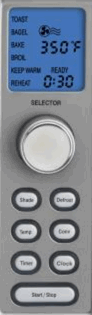
Two pet peeves. To select the function I want to use, I turn the dial, and the function that is selected blinks on and off. The problem is that it is a very slow blink, so the instant I turn the dial to the function I want, it disappears from the screen for a second and is no longer visible. So I keep turning the dial looking for the function. As I move to the next function, my previously selected function then re-appears so I then think it is selected.
The problem could be solved by either increasing the blinking speed or doing the exact opposite. Make all the other unelected options disappear or fade into the background, so the selected function is more prominent.
Although a dial is a great improvement over the up and down buttons, it could be simplified further. For instance, to set the timer I first click the timer button, then use the dial to adjust the time. So for several settings I need to jump between using a button and using a dial. It’s kind of like forcing a computer user to use the keyboard for some of the data entry, and then make them use the mouse for the other part.
If the function selection AND the adjustments could all be done just by using the dial (via turning and pushing ) it would be much better. In fact that is exactly what my wife tried to do (before reading the directions). She kept trying to push the dial to make a selection.
The nice thing about the dial is that it provides haptic feedback for each selection. For instance, as I turn it and the temperature adjusts by 25 degrees, there is slight resistance as if it is hitting a notch, like an old manual dial would do.
Unlike my main stove which does not have haptic feedback on the dial, and increments in only 5 degrees at a time, it is hard to dial to the exact temperature needed. I invariable pass over, back and forth across the desired temperature, until I eventually am able to stop it on the dot. It can be incredibly frustrating. In fact there are many times I give up and end up cooking something 5 to 15 degrees off from the suggested temperature just because it is too hard to dial into the exact temperature.
The Take Away
- Use a dial instead of buttons when the need is for more than a few incremental adjustments.
- Don’t make the user jump between two different input types (i.e. dial, button).
- Make the main function selections obvious and don’t use tiny text to display them.
- Remember the user’s last selection. They are likely to re-use those settings over and over.
- Don’t use so many icons (especially if it isn’t very clear what they are) that the user won’t remember what they stand for.
- Keep any use of color to a minimum, and don’t use it randomly or for decoration.
- Use lighting or highlighting to guide the user to available selections.
- Make sure a dial has haptic feedback for each selection/option.
- Don’t make the user’s selection disappear from the screen, even if it is just for a blinking second.
- And make sure you actually observe users and test different designs and re-iterate over and over until you get it right!
If you are interested in the model I ended up purchasing, it is the Cuisinart TOB-135N